Friday, September 30, 2011

These Days: Zack

These days Zack is adjusting to First Grade. It's pretty different than kindergarten for him. For us, we see playful lessons and minimal homework. But for him, he's sitting at a desk instead of a carpet square and expected to do lessons most of the day instead of just a little of the day. We see a classroom discipline system that's essentially the same with positive rewards and mild negative consequences. But he sees a stricter system and not much time to talk to his buddies.

What we both see is a good class and some good friends! We have started letting him go in earlier - sometimes thirty minutes before school starts when everyone goes to the cafeteria before they are allowed to go to their classrooms. It always seemed too early last year - we tried to keep the length of his school day from getting longer than it needed to be. But this way he can see his friends and talk to them before they go to the classroom (where they immediately start their lessons without any play time). We are starting to carpool after school, which is leading to some short playdates on a regular basis, which seems to be a great thing.

We also let him join some extracurricular activities: Cub Scouts and Chess Club. We've only been to one meeting of each but I think they are going to be a good fit. We're still waiting for our Tiger Cub den assignment but Zack's already asking how he can earn badges (they are actually belt loops at this age). Chess Club is pretty interesting - they have 110 kids! Almost all of them are second graders and older but Zack and a buddy are some of the few first graders and I think they'll be able to hang.

Friday, September 23, 2011

Scrapbook Layout: Elk Camp

I've been thinking this week about Elk Camp since my extended family has been there the past few weeks.  This is a two to three week camping trip out in the woods in northern Arizona.  Those who want (my dad, uncle, brother-in-law, etc) apply to a state drawing to get to do an archery hunt for elk.  We have gone in the past but did not go this year since Zack is in school now.  It's quite an experience!  you can read about the last time we went here

While I was talking to my family members on the phone and hearing about the crazy hail storms and incessant rain they've had, I realized I hadn't ever shown my layout about our previous trip.  I thought I'd go back and pull it out to show.

One thing that made this layout a challenge was that I had SO many pictures and so much journaling.  There was no way I could get down to just two or three pictures.  I managed to narrow it down to 16 photos - and that was hard enough!  Then I needed to have room to tell the main story of the trip plus some notes on each photo.  To me, the challenging thing about having so much is that the more you have, the more whitespace you need for the eye to be able to make sense of what is there.  I settled on a design that allowed me to include all those pictures and all that text and still have plenty of empty space (green space functioning as whitespace this time). 

To do that I really had to rely heavily on the structure provided by a grid, so I made several small collage photos in Picasa, printed them as 4x6s, and cut them apart to be used in a long strip of images.  I put them at the bottom of the page since the block seemed so weighty.  That allowed space for some featured images at the top. 

Finally, I used number stickers to number each image and journaled it's corresponding note below the grid.  This has given me a formula I can return to when I have tons of pictures for one story.  You make recognize I used it again here in the Kindergarten year-in-review layout. Give it a try if you need a design for lots of photos! 

Friday, September 16, 2011

Layout: Expert Road-Trippers

(as always, click on photos for larger versions)

Here is a layout I just finished about how the boys have really grown into car travel.  They can now hang out in the car for an all-day car ride like it's nothing!  It's soooo much easier than when they were little!  It started after the last of our Christmas travels, a ski trip just days after we got back from a family visit.  We could really tell we had turned the corner then, and sure enough they have been champs all summer.  If you have little ones, take heart:  they can adjust to it... with enough practice!

The original design for this layout was by Cheryl at one of her Stamp Classes.  I love love love these "Travel Log" stamps from Stampin' Up! Right now they are not available, as they were in a previous seasonal mini-catalog.  But they could always come back in next year's full catalog so cross your fingers.  Here is the original design:
Cheryl had us make all the elements including that awesome little map.  I usually take her designs and spin them just a little.  For one thing, I like to accommodate a lot of pictures.  Also, between printing and cutting, I end up with various picture sizes. I find I like things grouped together.  But mostly, I really enjoy starting with something neat and making it my own.

This time, I ended up with a lot of red accents in the photos and decided I also wanted a little red in my embellishments.  Also, I wanted to cluster the embellishments and didn't have quite enough to give it a layered look.  So, I made a tag out of an office supply tag and some matching circles.  I used a rosette my sister had made during her visit that happened to match.  Finally, I added a scrap of patterned paper (leftover from 
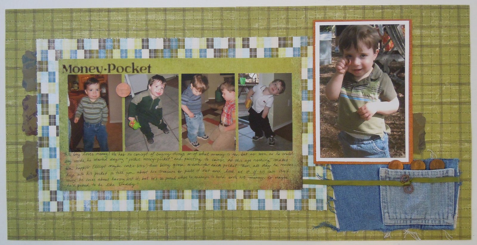
Money-Pocket) that tied the page colors together and filled in the gaps in my photo grid.  That gave me enough stuff to make some embellishment clusters and a nice visual triangle out of the red bits.

One thing I found interesting was that I had it like this and then tore up a few things and changed it to the version at the top of the post (yes, one of the tabs has fallen askew here but I've fixed that too).
 

I don't know if the difference is noticeable when you aren't looking at them side by side, but in this one the tag is tilted the other direction.  I thought I had everything like I wanted it but then it felt unbalanced.  I decided the lines of the tag were leading the eye off the page instead of onto it and switched the direction.  I don't know if anyone but me even sees the difference but I'm happier with it switched!


Friday, September 02, 2011

Scrapbook Layout: Money-Pocket

 
(as always, click on photo to see a larger version)
I wrote about Sammy's love for money in his pocket quite some time ago, but recently I was looking through our pictures and I decided I wanted a scrapbook layout about it too.  It was really fun to make because:
1) The journaling was already written in the blog post, so I could just play and not have to think too much, and
2) I threw in some non-traditional embellishments. 

That pocket is off a little pair of overalls Sammy had outgrown.  They had a hole in the front so I have been using them for various projects.  I pulled the strap hardware off for an earlier project and cut the little pocket out for this layout.  I like how the lighter fabric makes the pocket show up.  I also frayed out the edges of the surrounding denim to give it a well-worn look.

Also, those are real pennies - a shiny one for the embellishment on the photo strip and three darker ones to peek out of the pocket.  I was pretty amused by the idea of putting them on my layout.  The shiny one is dated the same year the photos are taken.  These are probably the cheapest embellishment around! Hee hee.

There are some random re-purposed bit in there too - the decorative labels are punched out of the pretty envelope this year's calendar came in, the green ribbon was a hanger strap off a dress (I always cut them off anyway so they aren't showing when I'm wearing the dress, but then I really liked the color), and the copper photo mat was a piece of a wedding invitation.  Strange stuff to save but pretty fun to use!