This year we stopped on the way home from our Christmas trip to visit McDonald Observatory in the Davis Mountains for one of their Star Parties. It was really wonderful and a perfect night for it, if cold. I learned a lot, so I am hoping the kids did too. And it was fun! I would absolutely recommend it if you can get there. It's not particularly expensive ($12 adults/$8 kids), but you do need to get a hotel room nearby because it ends late and is way out in the middle of the desert. James planned it near the new moon, and that was a good idea too. Even just the tiny sliver of moon was blinding to our dark-adjusted eyes until it set, early in the evening. The demonstrators did a presentation, telling a little about the observatory and showing us the constellations. They had laser pointers that made a super-long visible beam so that they could really point to each star! That made a big difference - knowing to what exactly they were pointing. And looking through the telescopes was very cool. We saw the clouds on the surface of Jupiter!
When I started writing down what I'd like to tell about the visit, I surprised myself by writing two pages. It wasn't that is was so momentous, but just that I was interested in telling the little information like how we saw the Orion Nebula and how we bundled the kids up by putting their jammies under their clothes and how one of the demonstrators took a special interest in Sammy and explained everything again just to him. I decided to just make it a double page spread and instead of narrowing down what I wanted to say, and to write very tiny!
My pictures were not awesome - one is a mostly dark shot of us inside one of the telescope domes. You can't really see anything but I used it because it evokes a memory for me. My other photo is a blurry shot of the boys drinking their hot chocolate but I love the Star Date Cafe sign in the background. The two photos of the Indian Lodge, the hotel within the state park where we stayed, are not bad, and I included them to show a little of the beauty of the mountain desert (and that I was there too, even though I'm not in any of the other photos!)
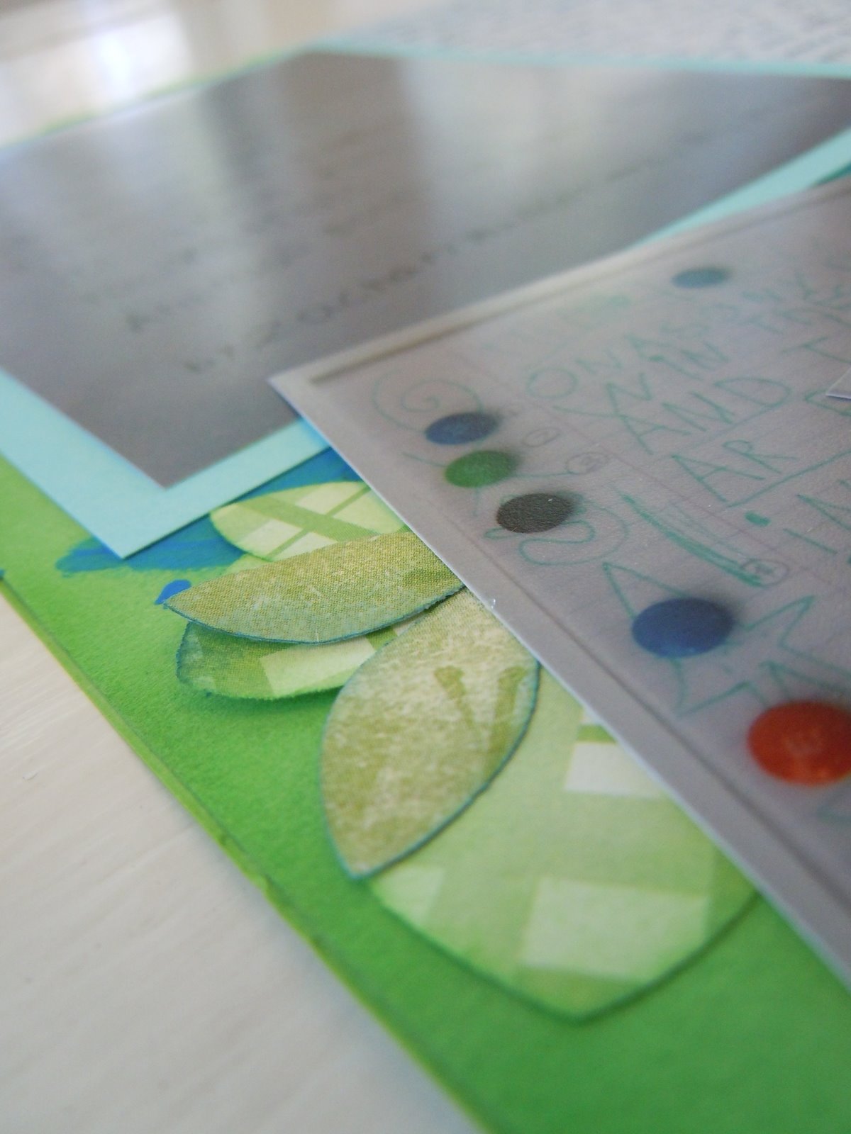
I started the layout with plain, navy blue cardstock and flicked some Mr. Huey Opaque White mist on it. I worked the main page around a piece of paper with a splattered pattern I had made some time ago and never used. It started with a piece of very glossy cardstock, then I dripped ink (from re-inkers) on it and blew the ink around with my heat tool while drying/heat-setting it. Pretty, but also odd, so it was sitting around unused. It had a fantastical-space-nebula feel to it so I wanted to use it for this page. I also wanted to use one of the stickers we each wore that were the "ticket" to the star party. I covered it with Glossy Accents. Although it didn't turn out quite as smooth as I would have liked, it's still thick and glossy and I like it. The only hitch with it was that the color was a neon yellow-orange and very hard to match! I found a couple of items that were close and called that good, including a little paper sack from a museum gift store. It was from another science museum but it has a similar memory-feel to me. I layered it with the nebula paper and a piece of packaging - a pretty, geometric-patterned background card from the new gloves I received for Christmas and wore to the Star Party.
I spent forEVER rearranging that stack of layers with my photos and a part of the observatory brochure. It was very difficult to get it balanced with the layers showing, the nebula showing and not give the feeling of trapped white space (meaning a blank unconnected space in between elements). It still has a little of that feeling but I like it anyway :). I mitigated it a little by using a strip of navy washi tape and a punch paper circle at the top of the photos to connect it to the title, which is made of silver foil Thickers.
The embellishment clusters were the most fun part of the layout! I used a very old set of die cut frame/squares and inked them a little darker with Stampin' Up! Midnight Muse. I used some yellow-orange paper to punch out gears (and the circles out of the middle of the gears), with the SU! gears punch (love that punch!!). I finished each area with silver dots, little silver glitter stars, and some dots of Stickles. OH, and the stars! Those are Heidi Swapp sequin stars. I've had them a while, but aren't they a perfect color match?
I do want to ask some people about white spray mist. I love the way that stuff looks, but I don't find that it dries properly. Advice, anyone? Even if i try heat setting it, it smears in the page protector later.
obsessive reader - chemical engineer - stay at home mom - sometimes cook - memory keeper - wannabe writer
Showing posts with label Kids. Show all posts
Tuesday, January 28, 2014
Tuesday, October 15, 2013
Scrapbook Layout: On the Wrong Feet
One of the most heard statements in Sammy's life used to be, "Your shoes are on the wrong feet." Because they were ALWAYS on the wrong feet. He seemed to prefer them that way - not only did he put them on wrong every time, but he appeared to be perfectly comfortable wearing them wrong. It happened so much it became a part of his personality.
I had these pictures printed and set aside with a little kit of papers I intended to use. However, when I was enjoying making use of old supplies on my last layout, I also came across this sheet of paper. I realized I was given the sheet when I was pregnant with Sammy - it is super cute but not so easy to use! I was tired of putting it off, so I decided to try a different approach - pick the paper first and then find something to do with it. I went through my photos and found this set to be a good fit. I also pulled out some supplies that had been around a while. The three little cards with the animals were not from the same manufacturer or kit as the paper, but don't they go together nicely? My favorite item is the strip of red elastic, the kind that is in children's adjustable waist pants (it came on a clothing tag), which I cut and used in two places.
The resulting layout is busier than my usual taste. I think that because I was focusing on the background paper, I didn't want to cover it all up with other papers. I might like it better with a little more visual space! Time will tell. The animals are certainly cute enough to make them fun to look at, and I like the memory represented here!
Monday, May 06, 2013
Lexington Liveaboard
We spent out weekend on something we've wanted to do for a few years: the overnight program called the Lexington Liveaboard. This is an overnighter that the USS Lexington, a WWII-era aircraft carrier docked in Corpus Christi bay and converted to a museum, conducts with scouts and JROTC programs where the kids (and parents for our kids' ages) stay overnight on the ship with a full schedule of educational (and fun) programs with the staff there. When we visited the USS Lexington a few years ago (the kids were so little!), we were really jealous of the families doing this, and were determined to take advantage of the opportunity if we got a chance. Our cub scout pack goes every two years, so we signed the whole family up.
The quarters were cramped! I should have taken a picture of our accommodations metal bunks stacked three high. The women were on one end of the ship and the men were on the other, making me wonder why I bothered to come... but we had a good time. The boys loved running around and exploring, we all got plenty of stair/ladder workout, and Zack was promoted from wolf rank to bear rank. We didn't get much sleep but we did have fun!
Monday, August 27, 2012
Saturday, August 04, 2012
St. Louis Zoo
Ok, while it's true that we particularly enjoy going to zoos, this may be one of the best zoos anywhere! It being FREE is pretty impressive. We loved it two years ago and we loved it again!! They have some new areas open that are really beautifully done. We liked the little education/involvement areas they added throughout the new spaces.
It was also really fun how many baby animals they had! There were baby and "teenage" elephants, baby monkeys, baby penguins, baby sting rays and lots more! The baby elephant was my favorite, and watching the teenage elephant swimming.
This time we remembered to use the train to move around the zoo and it was really fun and workable that way. We would get off at a station, do all the habitats in that area, then get back on and go to the next area.
One recommendation is to get the Safari Pass. Although the zoo is free the train does cost $5 for one time to each station (whether or not you get on and off). If you instead get the Safari Pass for $10, it allows unlimited train rides, carousel rides ($3), petting the sting rays and sharks ($3), and several other things! We really liked being able to ride the train without "using up" each section, and I don't think we would have paid for the carousel or the sting rays without it.
Petting the sting rays was especially awesome! We haven't gone to Sea World where they may have something like this so I'd never tried it. It was a bit magical to have the sting rays swimming right up and under your hand on their own. They are very soft and velvety! Zack and I were both really into it. James tried it once and was done. Sammy would have liked to but kept getting scared. The bench that you lean on was too high for him and the moving animals were too startling. Still, he did touch one once!
We thought we would stay til about 2pm and then go back to let the boys nap but the kids were super and we ended up staying until after 7pm! It was an unusually mild day, not too sunny, and we just kept going. Good times!
Tuesday, July 31, 2012
Family Reunion 2012
The main (or at least instigating) destination of our big road trip was our family reunion in McCormick's Creek State Park outside Indianapolis, Indiana. We spent three days there with about 60 relatives of my husband's father. It was a really nice time! We meet at that location because there is a full service hotel in the state park, making it a pretty setting that also has all the conveniences needed for that number of people. In addition there is a branch of the family that is local to that area who is really generous to have the whole group out for a dinner at their house.
One fun thing that has been added recently is a family talent show. This year Zack and his Uncle Bill did the Abbott and Costello routine, "Who's on First" - it was pretty amusing! They wrapped it up with Sammy singing" Take Me Out to the Ballgame", so there was cute factor too!
The best thing (well, the quilting part was great too, but I will tell you about that tomorrow!) was that the kids really formed and renewed relationships with their cousins (technically, second cousins once removed, I think). It was so neat to see the next generation remembering each other and playing together!
We wrapped the whole thing up with time of singing hymns and a brief candlelight moment in memory of family members. Quite a lovely and special time - we are looking forward to doing it again in two years!
Monday, July 30, 2012
Ballgame - The Cincinnati Reds vs. the St. Louis Cardinals
Our next stop was Cincinnati for a baseball game. We really wanted to see a ball game on our trip but the Rangers were out of town and we couldn't get good tickets to see the Cardinals-Cubs game in St. Louis so we decided to make Zack happy and see a Cincinnati game in the Great American Ballpark. He is, inexplicably, a big Reds fan. Although we do like both the Reds and the Cardinals, we had to root root root for the home team so we were all Reds fans!
It was a beautiful night (a bit hot) and a really great game - fast moving (not always the case in baseball!) and very exciting. The Reds won in the end to sweep the series and we all had a great time!!
Saturday, July 28, 2012
Louisville Slugger Museum and Factory
Since we took a more easterly route this year, we decided to visit Louisville to see the Louisville Slugger Factory and Museum. This is where they make baseball bats for everyone from Walmart through Major League Baseball.
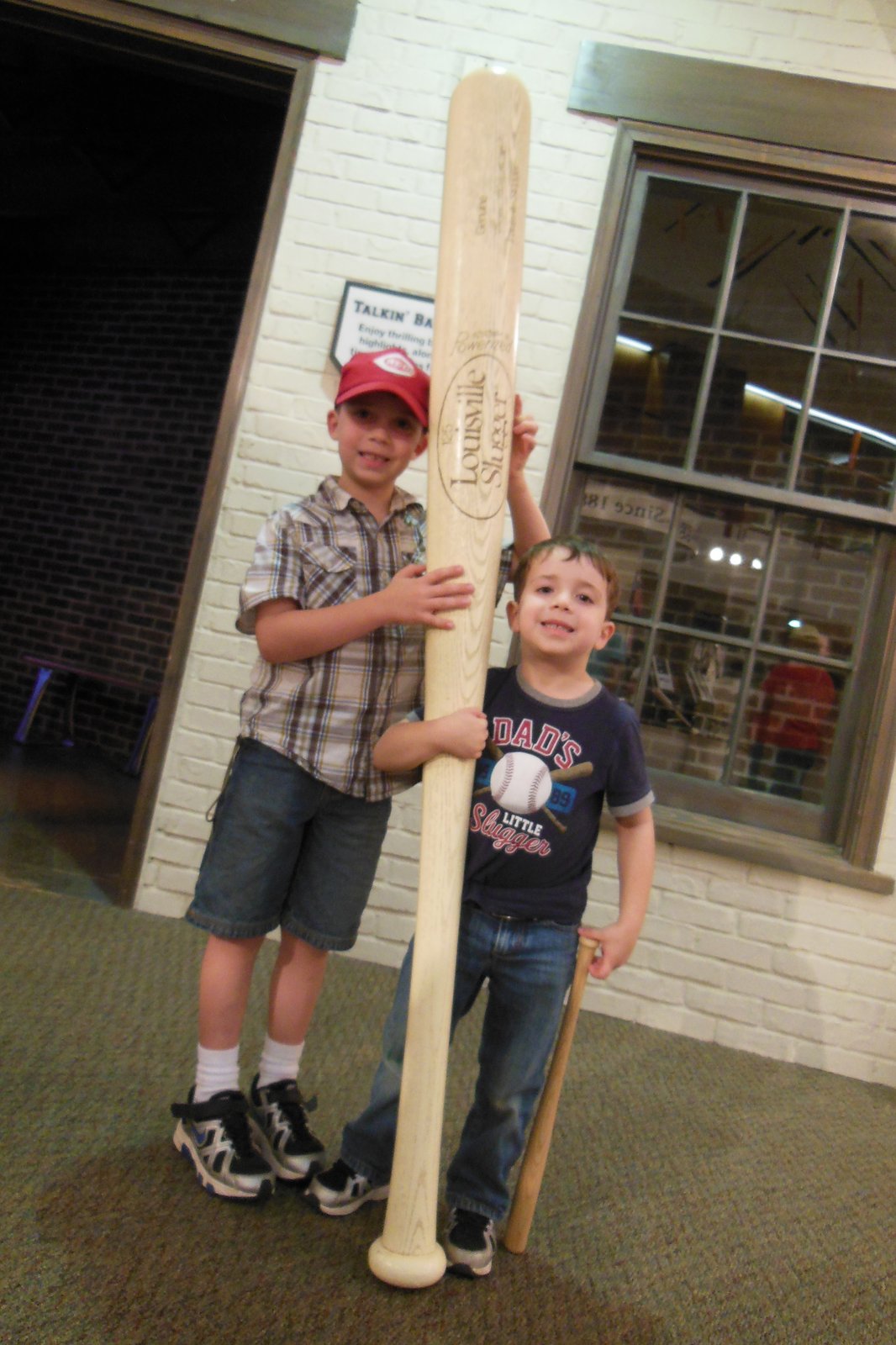
As you may remember, the boys are absolutely obsessed with baseball so this was right up our alley. There is a little movie (included with the tour), you can hold game-used bats from some of the famous players and you can bat at the batting cages ($1). You can even choose your bat based on the specs of historical and current players. James and Zack batted in the batting cages and then I had to go bat too. I was pleased that I actually hit the ball a few times and was not completely embarrassed! We all liked the Factory Tour where we got to see bats being made for various groups and for individual major leaguers. I am always interested in factories and even though it is a small operation, they turn out LOTS of bats! And everyone gets a free mini-bat at the end of the tour - an extremely exciting souvenir for the boys!
One really nice thing is that it is all indoors so it's a good thing to schedule in the heat of the day or do when it's pouring (as it was when we visited).
Friday, July 27, 2012
Mammoth Cave in Kentucky
Our first adventure was the Historic Tour of Mammoth Cave in Kentucky. It was a really neat tour, covering 2 miles of tunnels in the cave. I recommend it if you are ok with that amount of walking! It was pretty narrow, short and steep in places, but that made for more cave-excitement.
Our tour guide was really personable and funny and talked about different aspects of the cave formations and the history of the cave and the area as we went through. The area was beautiful and green. The air was VERY humid and then became chill as we approached the mouth of the cave. We were surprised at how cold it was, even though we read about the temperatures on the website! I had intended to bring sweatshirts for the boys and then had forgotten, but they kept themselves warm enough by being their usual "energetic" (ahem) selves.
We tried to take pictures but it was really difficult to get good shots (here are some if you want to see more) in the darkness of the cave. The pathway was lit, but dimly. There were some very large rooms plus areas we had to scoot sideways through or duck down for quite some length. At one point they turned off all the lights to show the darkness of the cave, then lit just a kerosene lantern to show what early explorers would have had to see by. We crossed The Bottomless Pit and heard about how the first explorer of the area crossed on a beam he rested across it, rather than on the steel bridge we had!
The boys really enjoyed it, though it was a little long for Sammy who said it was "too many walking". But really, it was fine for him until the very end. If you have the chance, give it half a day or more.
If you do, one last note - we went to the first tour of the day, buying our tickets online ahead of time to be sure we could go at the time that worked for our schedule. We were glad we did because the tour sold out, but that was also the downside: it was a HUGE group. The next tour was much smaller. We would have preferred a smaller tour because the group had to rush in many places to make up for the backup that would form in the narrow/steep places. I think a smaller tour would have let us go at a more even pace and see more.
Monday, May 14, 2012
Scrapbook Layout: Your Smile is the Key to my Heart
Here is a scrapbook layout featuring Sammy and his smile!
I have been wanting to do a layout to focus on Sammy's smile - how engaging it is and what a charmer he can be! Then I found I was able to use the just-the-face images in Picasa's facial recognition to find all the perfect photos. It was great because Picasa makes a thumbnail of the face for you to confirm the facial recognition and by selecting those thumbnails and using the collage feature I could print a bunch of small images without having to find, crop and collage the images myself. It made it soooo much faster!
The original title was "Key to my Heart" but I really wanted the "Smile" aspect so I added some elements from a very old embellishment pack with a matching stamp, epoxy sticker, and chipboard piece. The journaling is a little letter to Sammy that I wrote and then cut into strips to match the strip-y page design. I also added some extra hearts to fit the wind-blown design and inserted one extra color (I can't seem to help myself, I almost always find myself adding one extra color after the page is almost done!), the bright pinky-orange (Calypso Coral by Stampin' Up).
And you notice that I couldn't resist the counter-example photos - three little frowny faces by Sammy in the bottom right of the layout. Those are "so Sammy" too!!
Friday, November 04, 2011
Scrapbook Layout: Poetry Winner
Here is a scrapbook layout I did as an addition/complement to Zack's Kindergarten overview - the story of his poem he wrote for the school poetry contest. When he first heard there was a contest, with a winner for each grade, he dashed off a poem on the back of a page in a spiral notebook. It was written in green sparkly pen, very messy, with lots of random "decorations" all around. The spelling wasn't so great either! I knew we'd have to re-write it to submit it, but boy, was that a hard sell to Zack! He just hated having to write something already written and trying to use lowercase letters was really a trial. In desperation I resorted to... candy, of course!
I put an m&m at the end of every line, plus one for the title and one for his name and grade. He got to copy a line in his best handwriting and then take a "refreshing pause" and eat the m&m. Nothing could have worked better to get him to finish the copying! Since we didn't get the original back, I snapped a photo before turning it in.
Zack's teacher told me that when the results were read over the loudspeaker at school that they didn't name a winner for kindergarten. She had to run down and have them look again for K entries! Maybe he was the only entry for Kindergarten... but I think he might have won anyway, don't you? Hee hee.
What I liked most about Zack's poem was how it captured his love of books and alluded to the way he finds little hiding spots to squeeze into so he can be cozy while he reads. Someday I'm going to make a mini-book about the boys and reading - right now I tag photos with "books" in Picasa as I go so that later I can find them to capture the reading moments over the years. In the meantime, I wanted to make a layout about this particular story.
I normally make double-page layouts but I wanted some more variety and really, not every story needs two pages. So, I was determined to make this a single page, even when it was a lot harder to switch than I expected! I originally had printed the photos in 4x6 but then had to reprint some of them in different sizes to make it work. I put the poem itself in 5x7 and then cropped it down to the right proportions for the writing. The others I printed at half size. The two small photos of the original poem I wanted small because although they are repetitive, I wanted to use both of them. Small prints was the only way to make room. The photo of Zack in the Reading Loft I printed small because it was so busy and so high-color that it overwhelmed the page in a 4x6 size.
I ended up struggling with this layout a very long time, walking away and returning to it a few times over a few weeks (yes, weeks!). I wanted to use the blue construction paper "ribbon" they had given Zack but then had a hard time because it seemed so ugly with the dull color and uneven writing (I like handwriting, but usually I like writing of people I at least know!). I finally decided it just "is what it is" and put it on there as the title. I pumped up the contrast on the writing by going over it with Ranger black Enamel Accents. I also sprayed it with Archival Mist since construction paper seems to fade soooo quickly, so we'll see if that helps long-term.
I also had a hard time fitting in that giant journaling block. I wanted the whole thing to be balanced but I kept juggling the pictures. Finally I got an arrangement I liked, but then when I added the paint and glued it down I realized I put everything farther to the left than I had planned. Argh! It turned out like this:

I put an m&m at the end of every line, plus one for the title and one for his name and grade. He got to copy a line in his best handwriting and then take a "refreshing pause" and eat the m&m. Nothing could have worked better to get him to finish the copying! Since we didn't get the original back, I snapped a photo before turning it in.
Zack's teacher told me that when the results were read over the loudspeaker at school that they didn't name a winner for kindergarten. She had to run down and have them look again for K entries! Maybe he was the only entry for Kindergarten... but I think he might have won anyway, don't you? Hee hee.
What I liked most about Zack's poem was how it captured his love of books and alluded to the way he finds little hiding spots to squeeze into so he can be cozy while he reads. Someday I'm going to make a mini-book about the boys and reading - right now I tag photos with "books" in Picasa as I go so that later I can find them to capture the reading moments over the years. In the meantime, I wanted to make a layout about this particular story.
I normally make double-page layouts but I wanted some more variety and really, not every story needs two pages. So, I was determined to make this a single page, even when it was a lot harder to switch than I expected! I originally had printed the photos in 4x6 but then had to reprint some of them in different sizes to make it work. I put the poem itself in 5x7 and then cropped it down to the right proportions for the writing. The others I printed at half size. The two small photos of the original poem I wanted small because although they are repetitive, I wanted to use both of them. Small prints was the only way to make room. The photo of Zack in the Reading Loft I printed small because it was so busy and so high-color that it overwhelmed the page in a 4x6 size.
I ended up struggling with this layout a very long time, walking away and returning to it a few times over a few weeks (yes, weeks!). I wanted to use the blue construction paper "ribbon" they had given Zack but then had a hard time because it seemed so ugly with the dull color and uneven writing (I like handwriting, but usually I like writing of people I at least know!). I finally decided it just "is what it is" and put it on there as the title. I pumped up the contrast on the writing by going over it with Ranger black Enamel Accents. I also sprayed it with Archival Mist since construction paper seems to fade soooo quickly, so we'll see if that helps long-term.
I also had a hard time fitting in that giant journaling block. I wanted the whole thing to be balanced but I kept juggling the pictures. Finally I got an arrangement I liked, but then when I added the paint and glued it down I realized I put everything farther to the left than I had planned. Argh! It turned out like this:
which I felt was pretty, but lop-sided. I added my punched and inked leaves, echoing the foliage on the reading loft, a twisty ribbon flower, and a little paper pinwheel inspired by this quick video, but it still seemed lop-sided.
Recently Noell from Paperclipping, a great instructional video site with some free and some paid content, has had some excellent posts on the visual weight of different items and how to use it to achieve balance. There is some content you can read, though you do have to be a member to watch the entire videos (I think the membership is totally worth the cost!). I remembered how high-contrast things have high visual weight for their size, so I grabbed one of the label-sticker name tags Zack would come home from school wearing whenever the kids were meeting new people - I had saved several, in bad shape though they were. I added a little blue and green inking along the curled up edges and also inked up a chipboard z. After adding these I liked the balance of the whole thing. Compare the first and last pictures (click on them for a better view) and see the difference!
Wednesday, November 02, 2011
Lookout, there's a ninjashark behind you...
I hope everyone had a great Halloween! We did, though my boys were VERY tired by the end of the weekend fun + Monday holiday. They made it through trick or treating with lots of smiles and lots of fun, though. And, neither had a meltdown at school yesterday so we're calling that a success. EARLY bedtimes this week!
Subscribe to:
Posts (Atom)