

I put an m&m at the end of every line, plus one for the title and one for his name and grade. He got to copy a line in his best handwriting and then take a "refreshing pause" and eat the m&m. Nothing could have worked better to get him to finish the copying! Since we didn't get the original back, I snapped a photo before turning it in.
Zack's teacher told me that when the results were read over the loudspeaker at school that they didn't name a winner for kindergarten. She had to run down and have them look again for K entries! Maybe he was the only entry for Kindergarten... but I think he might have won anyway, don't you? Hee hee.
What I liked most about Zack's poem was how it captured his love of books and alluded to the way he finds little hiding spots to squeeze into so he can be cozy while he reads. Someday I'm going to make a mini-book about the boys and reading - right now I tag photos with "books" in Picasa as I go so that later I can find them to capture the reading moments over the years. In the meantime, I wanted to make a layout about this particular story.
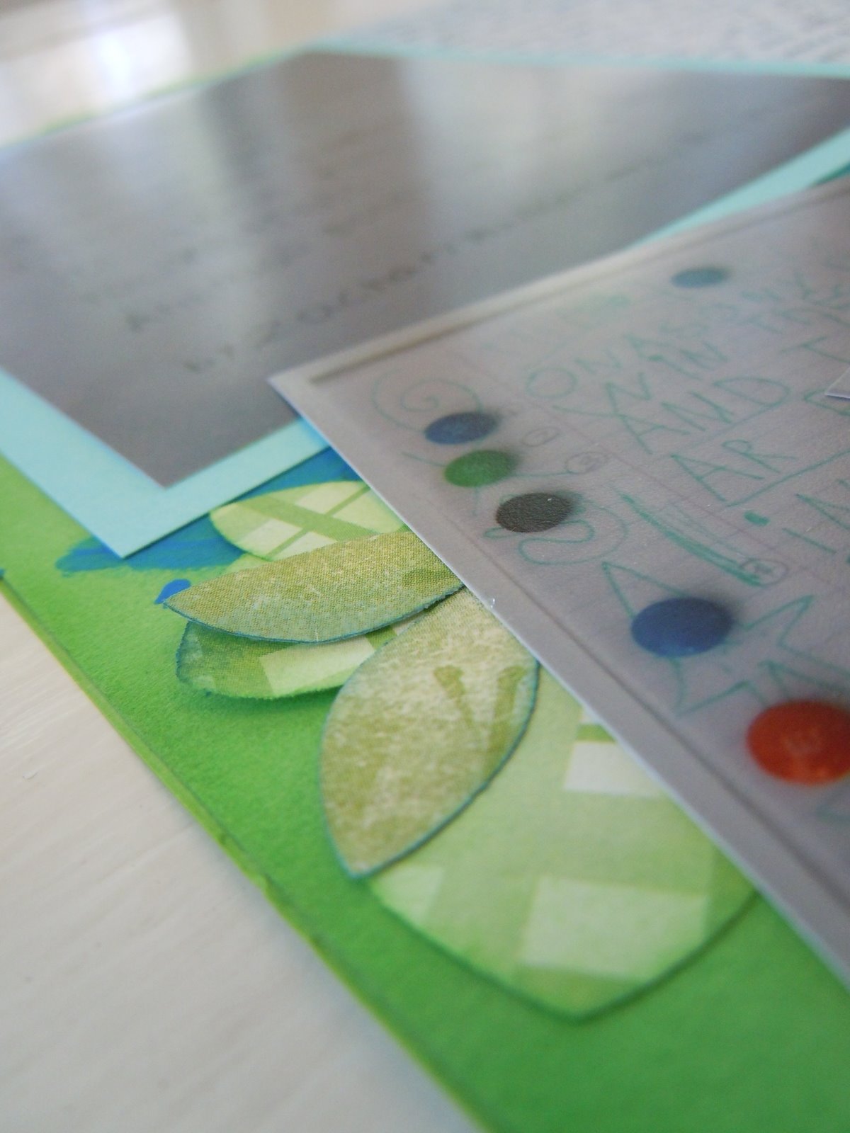
I normally make double-page layouts but I wanted some more variety and really, not every story needs two pages. So, I was determined to make this a single page, even when it was a lot harder to switch than I expected! I originally had printed the photos in 4x6 but then had to reprint some of them in different sizes to make it work. I put the poem itself in 5x7 and then cropped it down to the right proportions for the writing. The others I printed at half size. The two small photos of the original poem I wanted small because although they are repetitive, I wanted to use both of them. Small prints was the only way to make room. The photo of Zack in the Reading Loft I printed small because it was so busy and so high-color that it overwhelmed the page in a 4x6 size.
I ended up struggling with this layout a very long time, walking away and returning to it a few times over a few weeks (yes, weeks!). I wanted to use the blue construction paper "ribbon" they had given Zack but then had a hard time because it seemed so ugly with the dull color and uneven writing (I like handwriting, but usually I like writing of people I at least know!). I finally decided it just "is what it is" and put it on there as the title. I pumped up the contrast on the writing by going over it with Ranger black Enamel Accents. I also sprayed it with Archival Mist since construction paper seems to fade soooo quickly, so we'll see if that helps long-term.
I also had a hard time fitting in that giant journaling block. I wanted the whole thing to be balanced but I kept juggling the pictures. Finally I got an arrangement I liked, but then when I added the paint and glued it down I realized I put everything farther to the left than I had planned. Argh! It turned out like this:

which I felt was pretty, but lop-sided. I added my punched and inked leaves, echoing the foliage on the reading loft, a twisty ribbon flower, and a little paper pinwheel inspired by this quick video, but it still seemed lop-sided.
Recently Noell from Paperclipping, a great instructional video site with some free and some paid content, has had some excellent posts on the visual weight of different items and how to use it to achieve balance. There is some content you can read, though you do have to be a member to watch the entire videos (I think the membership is totally worth the cost!). I remembered how high-contrast things have high visual weight for their size, so I grabbed one of the label-sticker name tags Zack would come home from school wearing whenever the kids were meeting new people - I had saved several, in bad shape though they were. I added a little blue and green inking along the curled up edges and also inked up a chipboard z. After adding these I liked the balance of the whole thing. Compare the first and last pictures (click on them for a better view) and see the difference!
Recently Noell from Paperclipping, a great instructional video site with some free and some paid content, has had some excellent posts on the visual weight of different items and how to use it to achieve balance. There is some content you can read, though you do have to be a member to watch the entire videos (I think the membership is totally worth the cost!). I remembered how high-contrast things have high visual weight for their size, so I grabbed one of the label-sticker name tags Zack would come home from school wearing whenever the kids were meeting new people - I had saved several, in bad shape though they were. I added a little blue and green inking along the curled up edges and also inked up a chipboard z. After adding these I liked the balance of the whole thing. Compare the first and last pictures (click on them for a better view) and see the difference!
I love this story! Great job Zack!
ReplyDeleteI love his poem! It is the sweetest thing. Your layout turned out so well! I do really like it with the name tag added. What a good idea! Hmm, I must resist the temptation to follow your link to the videos. We both know what happened last time you sent me a link to crafty videos!
ReplyDelete