You may remember this photo that James took this spring when he took the boys on an outing to the Texas state capitol building. I really liked the drama of the photograph, with that scraggly tree silhouette, the dark lamppost and no one else in sight!
For some reason the layout didn't photograph well - I tried it in a couple of different lights but the picture part of the layout always looked dull and blurry. Oh well, you can see the real image in the link above if you would like to.
I wanted to use a black and cream/kraft color scheme to highlight the image. I chose a black background and black photo matte and then filled in the other colors from there. I had everything designed and then added the black flourish to the background. It reminds me of the metal work in old fashioned trim and air registers. I really really like it - it turned out to be my favorite part of the layout!
obsessive reader - chemical engineer - stay at home mom - sometimes cook - memory keeper - wannabe writer
Monday, August 29, 2011
Friday, August 26, 2011
I'm going to a brayer workshop!
But not until February. Still, I'm excited. This is the instructor:
http://zindorf.blogs.splitcoaststampers.com/
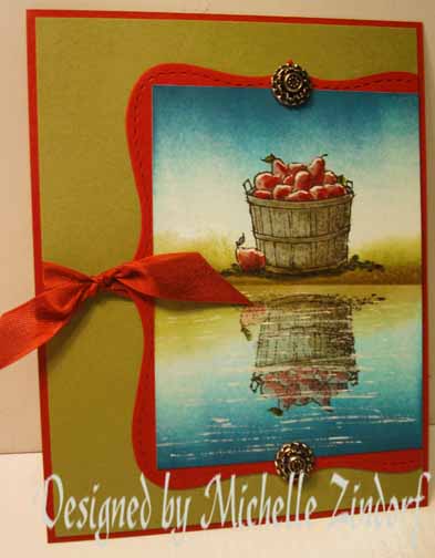
She does really cool stuff. Like check this out. The apple basket is a stamp and the rest of the scene was created with a brayer. (Click on the picture to see the full post - lots of larger pictures and step by step instructions.)
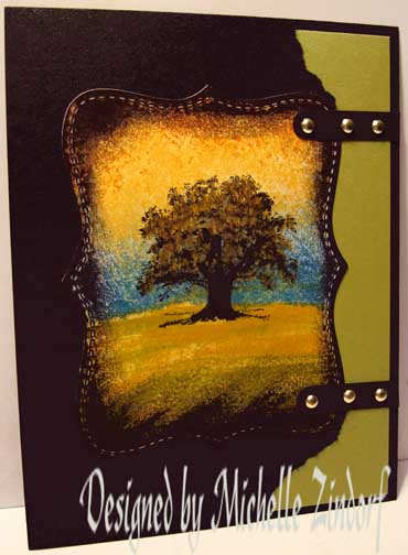
Or this one. Again, the tree is a stamp but the whole scene looks much different than it would with only the stamp.
Pretty impressive, right? I'm really looking forward to the class!
Thursday, August 25, 2011
Scrapbook Layout: Kindergarten
I wanted to do a single layout looking back over Zack's whole Kindergarten year, so I put together this review. That framed picture on the top left is from the first day of school and the one of Zack and his teacher at the bottom right is from the last day of school.
There are lots of photos- 16! - so I made sure to group them pretty tightly to leave quite a bit of whitespace (or bluespace in this case) in order to give the eye some rest on the page. To print my photos in sizes that make this easy, I made collages of two, three or four photos in Picasa and print them as 4x6's. It's cheap and it turns out even!
The large letters are stickers. I had a sheet of the alphabet with only one of each letter, all capitals, all different fonts. It was a really cute sheet but I wasn't sure what words I could make with it and I didn't have plans for an alphabet album. I decided to jazz up my background with the alphabet tucked behind my photos instead. A few of the letters were bright green and stood out too much, so instead of using the green ones I stamped those letters in Stampin Up Tempting Turquoise ink.
I like how it turned out, but I think I'll go back and add some notes identifying the first and last day photos and I think I should put Zack's name in it somewhere - I missed that somehow! Zack still likes it:
Monday, August 22, 2011
Back to School
Hard to believe Zack is starting First Grade! We went and met the teacher on Friday. She seems very warm and organized and even though she looks young she has many years of teaching experience. That's her in the first photo.
Today we headed off bright and EARLY for his first day. He has three boys, favorite friends from kindergarten, in his class plus some of the girls he is friends with. He's sitting next to two of the boys and back to back with the other, so he's thrilled. The mom's have already warned them that friends get separated if they talk while the teacher is talking! The kids were all a-buzz with their new desks and their supplies all set up for them. Very cute. I didn't cry, but it does seem like he's growing up fast. Sniff, sniff!
Saturday, August 13, 2011
Scrapbook Layout: Pieces
This is a layout Cheryl designed at her Stamp Class, but that I put together in a different way. I used almost all the same pieces, but it turned out so different! (I hope Cheryl doesn't think I wrecked her design!)
These pictures are ones that my sister has recently scanned in her effort to digitize all our family photos (quite a project, and one I'm really grateful for!). These are all me as a toddler or pre-schooler. We have been so entertained by looking at these types of pictures because we immediately see features that we notice in our own kids. I think Sammy does a little side bend like the top left picture, and the older pictures of me remind me of Zack's smile. My mom looked at these and could remember where several of the dresses came from - she made the red with white rickrack hat and long-sleeved set (at the bottom of the title) so I would be shaded in the boat while my dad fished.
If you are curious about the puzzle pieces, check out Cheryl's post here - she has the supplies listed too. One thing she doesn't mention is the crumpled style flower at the left. We had three flowers punched with the Fancy Flowers Punch. We misted all of them with water and then crumpled them up into a tiny ball! It was intimidating to crunch our pretty flowers! But then we opened them up, let them dry and inked them a bit and it made a beautiful vintage effect, especially fastened together with that fancy Antique Brad.
Subscribe to:
Posts (Atom)